UiShowSpecifier buildUserShow(User u) {
    new UiShowSpecifier().ui {
        field 'Picture',                                (1)
            attachmentUiService.previewFull(u.mainPicture?.id)
        fieldLabeled u.username_                        (2)
        fieldLabeled u.firstName_
        fieldLabeled u.lastName_
        fieldLabeled u.businessUnit_
        fieldLabeled u.subsidiary_
        fieldLabeled u.mail_
        fieldLabeled u.manager_
    }
}Table of Contents
-
Rendered into HTML
-
Rendered into PDF
-
Rendered into CSV
This DSL is used to display information with limited edition capabilities. Field can be styled.
Code Sample
| 1 | Explicit label and value (here HTML code) |
| 2 | The label is deduced from the field, note the underscore at the end of the field name |

Figure 1. Corresponding Rendering, inside a modal
Sections, Actions and Styles
new UiShowSpecifier().ui {
    section "Partner", {
        showAction ActionIcon.SHOW * IconStyle.SCALE_DOWN,  (1)
            this.&showContact as MC, partner.id
        fieldLabeled Style.EMPHASIS + Style.BLUE,           (2)
            partner.name_
        fieldLabeled partner.branding_
    }
}| 1 | The icon is displayed at the end of the next field value, it has to be scaled down in order to fit near the field |
| 2 | Styles come first, and can be combined using + |
Grid Layout
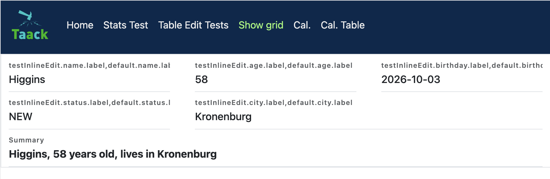
new UiShowSpecifier().ui ShowLayout.GRID, {                      (1)
    fieldLabeled item.ref_
    fieldLabeled item.name_
    fieldLabeled item.itemStatus_
    fieldLabeled item.gtin_
    fieldLabeled Style.SPAN_TWO, item.labeling_                  (2)
    fieldLabeled Style.BOLD + Style.SPAN_FULL, item.description_ (3)
}| 1 | ShowLayout.GRID lays the fields out on an auto-fitting grid instead of vertically in a column. The default is ShowLayout.LIST. |
| 2 | Each field takes one grid cell by default. Style.SPAN_TWO / Style.SPAN_THREE let a field span more columns. |
| 3 | Style.SPAN_FULL makes a field span the whole row. |
The grid auto-fits as many columns as the container width allows, each at least 220px wide (the minimum can be overridden in your CSS via the taackShowGrid class).
HTML Content
Some elements write their String value as is, others sanitize it (only basic formatting tags and links are kept, <img>, <div> or scripts are removed):
| Element | HTML |
|---|---|
|
Sanitized |
|
Sanitized |
|
Written as is |
|
Written as is |
|
Written as is, in a |
new UiShowSpecifier().ui {
    field 'Picture', attachmentUiService.previewFull(u.mainPicture?.id) (1)
    field Style.BOLD, '<b>Summary</b><img src="...">'                   (2)
    fieldLabeled u.username_                                            (3)
}| 1 | Labeled field: the picture HTML is displayed as is |
| 2 | No label: sanitized, the bold text is kept, the <img> tag is removed |
| 3 | Value of a domain field: sanitized |
| Elements written as is are not escaped: only give them HTML built by the application, never data typed by users. |
DSL Elements
-
section: labeled group of fields -
fieldLabeled: field value with a label deduced from the field (i18n) -
fieldUnlabeled: field value without label -
field: field with an explicit label (field 'Print Date', new Date().toString()), or HTML code (field Style.ALIGN_CENTER, '<h1>Title</h1>') -
inlineHtml: raw HTML code, with an optional CSS class -
showAction: icon or link calling an action, displayed at the end of the next field
DSL Symbols Hierarchy
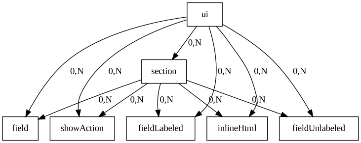
Figure 2. Symbols hierarchy diagram for Show DSL